

“Doesn’t Procreate mean using dozens of layers?”
If that’s what you think — my answer is no.
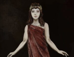
This work, “Longing,” was completed with just 3 layers. One brush: the 6B Pencil. Canvas: A4 at 300 dpi. The simpler the tools, the more you can concentrate on the picture. Since I realized that, painting has become fun.
This time, I’ll walk through the whole process, from the rough sketch to the finish, with pictures.
Previously: the story of painting a Taisho swimsuit is here (in Japanese)
[Canvas Settings] First, Build the Foundation
- Size: A4 (210 × 297 mm)
- Resolution: 300 dpi
- Color profile: sRGB (required for listing on INPRNT!)
At 300 dpi, you can list your work on overseas print platforms as-is. Get this wrong at the start and you’ll suffer for it later, so be careful.
Procreate’s initial settings (canvas, dpi) are here (in Japanese)
[Layer Structure] The Roles of Just 3 Layers
- Layer 1 — Line art (6B Pencil)
- Layer 2 — Coloring (6B Pencil)
- Layer 3 — Background & finishing (6B Pencil)
Many tutorials recommend splitting layers up finely. But the more layers you have, the more they press on the iPad’s memory, and the heavier it runs. Limiting it to 3 has another merit: you can always paint while seeing the whole picture.
[STEP 1] Start with a Rough That Doesn’t Draw the Face
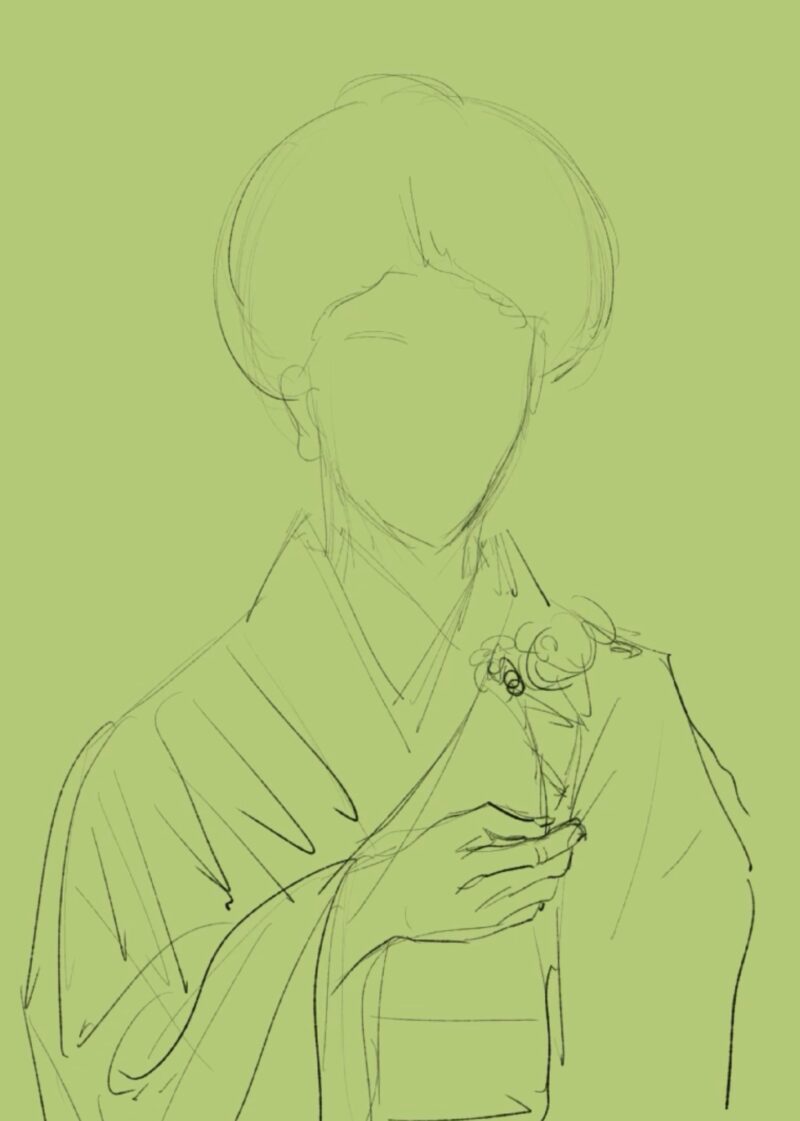
The first thing I draw is not the face. It’s the silhouette and composition.
The shape of the round mage hairstyle, the drape of the kimono, the position of the hand holding a flower — I decide these first. Draw the face first, and the balance tends to get pulled toward it and collapse.
- Brush used: 6B Pencil, opacity 30–40%
- Layer used: 1 — Line art
[STEP 2] Add the Face (Without Making a New Layer)
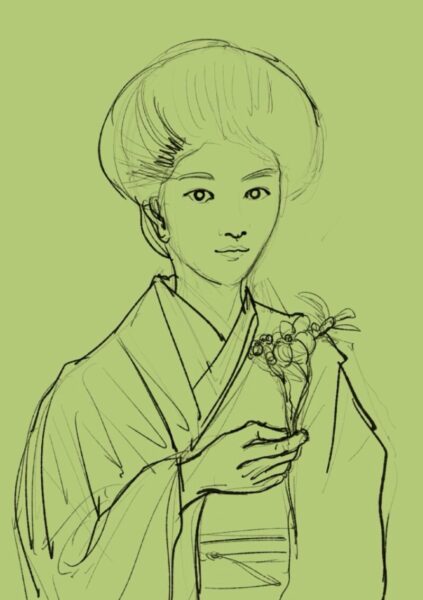
This is the most distinctive part of my process.
When I add the face, I don’t make a new layer. I paint right on top of Layer 1, the line-art layer.
“What if I make a mistake?” you might think. But erasing and redrawing, layering corrections on top — that feels close to analog painting, and it suits me. I draw the eyes, brows, nose, and mouth in that order, and add the flow of the hair last.
[STEP 3] Lay Down Color. Finish the Face First
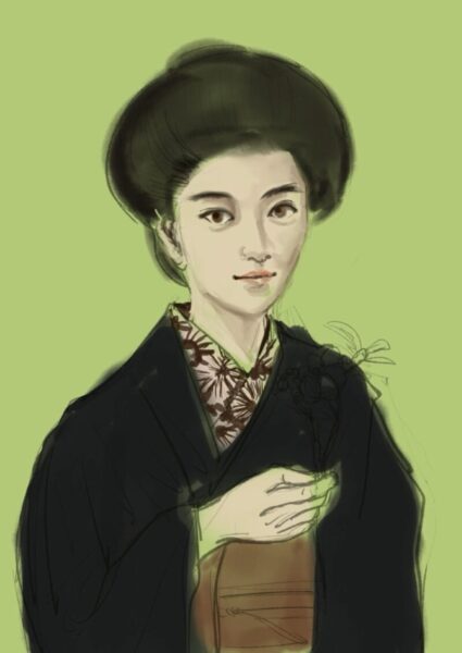
I switch to Layer 2, the coloring layer, and place the colors. The first thing I paint is always the face.
The reason is simple: once the face is set, the direction of the whole work becomes clear. The tone of the skin, the depth of the eyes, the redness of the lips. Once these are fixed, the colors of the kimono and the background fall into place naturally.
At this stage, the body and kimono still show the line art through them. And that’s fine.
- Brush used: 6B Pencil, opacity 60–80%
[STEP 4] The Subtractive Finish
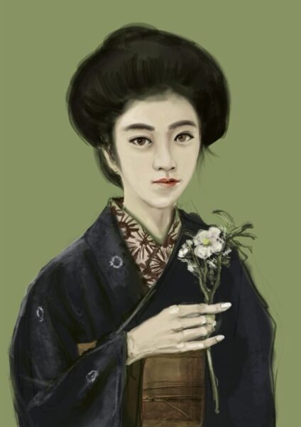
This stage is the hardest. I deliberately cut away information that I painted in too much.
The kimono’s pattern, the details of the fingers, the number of petals. Things I first drew finely, I paint over and simplify.
Deciding to subtract is far harder than deciding to add. But once you get through it, there’s a feeling that the picture turns from a “drawing” into a “work.”
And yet, this work is easy precisely because it’s digital. With analog, it would be absolutely impossible.
[STEP 5] The Background Changes the World
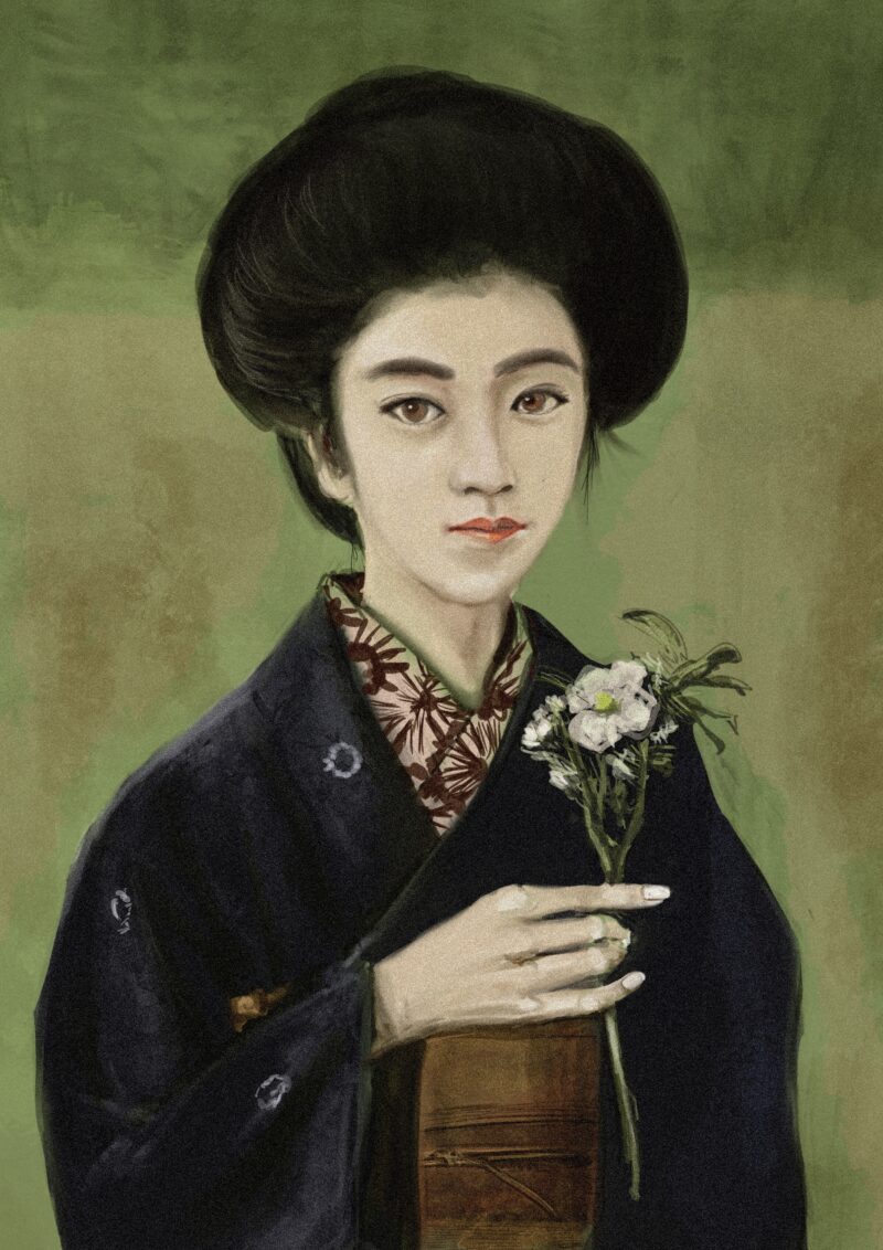
Now Layer 3 — the background and finishing layer — takes the stage.
The background, a flat yellow-green until the previous stage, becomes an oil-painting-like texture. Mixing green, brown, and gold, dabbing the colors on, a depth like that of a classical painting emerges.
With this single move, the impression of the work becomes something else entirely.
Completion — and On to INPRNT
The title is “Quiet Bloom.”
After completion, I exported it from Procreate as a JPEG in sRGB and uploaded it to INPRNT. I’ll explain the export settings and how to list in another article.
Summary: The Merits of the 3-Layer Method
- It saves the iPad’s memory
- You can always paint while seeing the whole picture
- You can work with an analog feel
- Management is simple — no getting lost
The simpler the tools, the more you can concentrate on drawing. If you’re lost among layers, please give it a try.
Also read: introducing the illustration “Botchan” (in Japanese)
Also read: “Painted with Only 3 Layers: The Full Procreate Process Behind the Taisho Roman Bijinga ‘Longing'”
What I Used for This Article
- INPRNT listing page / https://www.inprnt.com/gallery/morirancru/



Comments