


Here is the complete process up to the completion of “Longing” in the Taisho Roman series. This time, I’ll reveal without hiding anything how I reproduce that “oldness.”
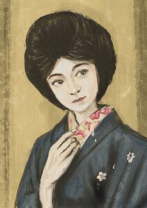
The work’s title is “Longing / Bojo – Longing.” I painted a Taisho woman in a deep indigo kimono, her hand resting softly at her collar. Just 3 layers. One brush: the 6B Pencil. That’s all.
[Canvas Settings] Starting with Settings That Look Ahead to Overseas Sales
- Size: A4 (210 × 297 mm)
- Resolution: 300 dpi
- Color profile: sRGB (essential — leaving it in Display P3 causes errors on INPRNT!)
With these settings, once the work is finished you can list it on INPRNT or Fine Art America as-is. Trying to change them later shifts the colors, so set them first, without fail.
The difference between Procreate’s one-time purchase and its subscription is here (in Japanese)
[Layer Structure] Why I Narrow It Down to 3
- Layer 1 — Line art (6B Pencil)
- Layer 2 — Coloring (6B Pencil)
- Layer 3 — Background & finishing (6B Pencil)
The more layers you add, the more work it takes to manage “which layer am I drawing on?” Narrowing it to 3 lets me concentrate on painting without hesitation. That’s my way.
[STEP 1] Put the Facial Features In from the Very First Rough


This time, I drew in the eyes, nose, and mouth from the very first rough.
The silhouette of the mage hairstyle, the angle of the kimono collar, the tilt of the neck. And at the same time, I paint while imagining “what expression does this woman have?” The title “Longing,” by the way, was an afterthought. In my case, I often decide the title after the work is finished.
- Brush used: 6B Pencil, opacity 30–40%
- Layer used: 1 — Line art
[STEP 2] Layer Lines to Find the Form
I don’t make a new layer. I redraw right on top of Layer 1, the line-art layer.
Not erasing and redrawing, but layering lines to search for the right form — the same feeling as an analog sketch. For me, the iPad is less a digital tool than an electronic croquis book; that’s the image I use it with. Once the roundness of the face is set, next comes the shape of the hand resting at the collar. I fix the angle of each and every finger firmly at this stage.
[STEP 3] Start Laying Color While the Background Is Still White

I switch to Layer 2, the coloring layer. The background can stay white for now.
The first things I paint are the black of the hair and the skin tone of the face. Once these two colors are set, the indigo of the kimono and the ocher of the background come into view naturally. A color can’t be decided in isolation — only in relation to its neighbors can the right color be found.
- Brush used: 6B Pencil, opacity 60–80%
[STEP 4] Toward the Kimono, While Finishing the Face

While raising the finish of the face, I spread the indigo of the kimono.
What took the most time in this work was the red floral han-eri collar. Within the overall calm tones, only the red of the han-eri stands out vividly. Paint too much and it tends to turn gaudy — deciding to stop just short of that was hard.
[STEP 5] The Background Decides the Era

Layer 3 — background and finishing — takes the stage.
Onto the white background, I lay an ocher, washi-style texture. Not painting it evenly, but creating unevenness like an old photograph. Mixing green, brown, and gold and dabbing them on, a flavor and depth like an old photograph emerges.
The moment I put in the background, I felt the woman change from “a person of now” into “a person of 100 years ago.” This one move decides the work’s era.
[Actually 4 Layers?] Revealing How the Layers Really Are

I said “painted in 3 layers,” but precisely speaking, effectively 2 layers are the main ones.
- Layer 2 — almost exclusively for highlights (the light in the eyes, the sheen of the skin, the gloss of the kimono)
- Layer 3 — the main layer for the figure and coloring
- Layer 4 — background texture
- Background color — an ocher base (Procreate’s background color feature)
The topmost Layer 2 exists only to put white on at the very final finish. Most of the painting is concentrated in the single Layer 3.
[The Secret of the Finish] Making a 100-Year-Old Texture with Noise

There’s a function I use right before completion: Procreate’s Adjustments → Noise.
By applying a slight noise over the whole picture, the smooth texture peculiar to digital disappears, and a graininess like an old photograph or a print is born. Look at a Taisho-era portrait photograph, and you’ll always find this grain. This is the final move to reproduce it digitally.
Too much makes it dirty, so about 5–10% is the guide. The effect shows more when printed than on screen.
Completion — and On to INPRNT
The title is “Longing / Bojo – Longing.”
After completion, I exported it from Procreate as a JPEG in sRGB and uploaded it to INPRNT. The color-profile settings at export are explained in detail in another article (in Japanese).
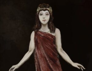
Continued: the story of painting Salome, princess of antiquity, is here
Summary: What I Value in 3-Layer Painting
- Don’t add layers — concentrate on painting without hesitation
- Start with an image of the expression and pose from the beginning
- Don’t isolate colors — decide them in relation to their neighbors
- Before painting in, decide “I’ll stop here”
- Put the background in last to decide the work’s era and atmosphere
Tools can be simple. What matters, I think, is deciding before you paint “what do I want to convey?”
Also read: “Painted with Only 3 Layers: The Full Procreate Process Behind a Taisho Roman Bijinga”
What I Used for This Article
- INPRNT listing page for “Longing” / https://www.inprnt.com/gallery/morirancru/


Comments